


A long time ago I took a theater class at UNR (University of Nevada, Reno). For our midterm we had to do different scenes from famous comedy plays. I played Oscar Madison in Neil Simon's, The Odd Couple.
The scene we chose was the "It's not spaghetti". You can see the original production bellow. Basically, Oscar and Felix get in a fight and Oscar takes a plate of linguine and throws it against the wall.
I decided in our production, I would take the plate and instead of throwing it against the wall, I would throw it into the audience - It was a paper plate with colored fabric that looked like Linguine with sauce.
It went off without a hitch. I threw the plate into the audience and the reaction was perfect. Everyone started screaming and then there was laughter as the ones hit realized it was only fabric.
My professor gave me a big, fat "C". He said what I was doing wasn't art, it was a practical joke.
What is art?
National Public Radio recently did a program on the NEA's finding that over 78 million of us Americans create art. This includes traditional artwork like painting and singing to non-traditional artwork like building models or creating a blog page.
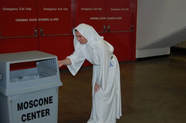
Is this Art?
The study also found that our viewing of traditional arts is going down. Not only are fewer of us attending art shows and plays but those who are attending are older.
Is this a good thing or a bad thing? Is their more "Art Value" in attending a Broadway play than there is attending a comic book convention dressed as Princess Leah? What is a professional artist these days? I think it is just as difficult to answer as who is a journalist.
I think accessibility has really changed the paradigm here. If you take painting for example, an artist in the 17th century was a painter, a chemist, a tailor and a carpenter. There was no buying paint from the Dick Blick.
I feel very lucky, I can go to Home Depot and pick up a pint of discarded paint for about fifty cents. A good tube of acrylic paint can cost about three dollars and if you buy the craft paint it is about seventy five cents. A whole package of brushes only run you about four bucks and stretched boxed canvas is around ten dollars.
When I started painting, I got into it for less than a hundred bucks.
But is this accessability a good thing? Does it make the artist community stronger and more diverse? I say both yes and no. I've seen a lot of poorly drawn horses, barns, lighthouses and dolphins lately. The crap has overloaded the channel. I mean just go to Ebay and type "art". It is Dodge City all over again and there are many bloody bodies in the street.
I recommend that professional artists be a little more professional. I talked to many professional artists who have no idea what abstract, impressionism or cubism are. They are not familiar with great artists like JMW Turner, Gerorgia O'Keeffe or even Andy Warhol. My feeling is that if you do not understand the foundation and movement of art through time it does not matter how talented you are - your work will still be craft oriented.
Also, an artist must have an intricate knowledge of the materials and chemicals they use to create art. One should know at last the basics of the different paint types, varnishes, canvas and brushes. Presevering a work is almost as important as creating a work.
Jun 18, 2009
What is Art?

Jun 25, 2008
Can You Sea?
I am working on this painting for about a two weeks. I wanted to do a two layere piece with geometric shapes that showed the paint underneath. I started first with a pig's hair brush. I painted highly textured vertical lines. I used a denim blue and sea foam green. I placed each color on opposite ends of the brush and lightly painted - the brush barely touching the canvas. Also, I heavily thinned the paint using Createx base.
After letting paint dry for half a day, I used common school glue and lightly poured the shapes I wanted. The school glue works great, but tends to spread out more than liquid wax. It's also harder to remove. Anyway, I gave the glue a good 24 hours to dry. I then painted over the the glue and the base color with an acrylic dark blue. I only lightly thinned the color with base. Again, I used a pig's hair brush to create texture, but used a full brush and heavy stroke upon the canvas. I painted vertical lines up and down until a fully covered the glue and base paint.
I waited another full day for the paint to dry and then carefully removed the glue. Sometimes, I had to use the dull edge of a butter knife to pop the glue off. I was surprised to see how much the glue had spread out, but it did maintain a tight seal and didn't let the second layer paint seep through.
On the other side, I painted a base teal green coat as the base layer. I used a good pigment acrylic paint - Winsor & Newton Galeria "Pale Olive". I wanted an academy level paint, because I knew I was going to put many layers of paint on top and did not want any separation.
I wanted to create a multicolor wavy effect. I used several different paints: Liquitex Bronze Yellow, Jo Sonja's Permanent Alizarine, Jo Sonja's Olive Green, Grumbacher Yellow Ochre Light, Dick Blick Raw Sienna, Folk Art Grass Green, Folk Art Pine Green, Apple Barrel Coffee Bean.
I drew verticle lines creating demension by apply a dark color first and the hightlighting that color with a lighter color. I continued this until the whole half was filled in.
So, as you can see I have created my pattern for the base layer. Now, to pour glue in the outlined shape of kelp and hope this structure looks like the textured plant. That is the plan ...
I am a little embarassed using Folk Art and Apple Barrel. Folk Art is a much better paint, but still both are only craft quality. The pigment color should not fade and the paint is from the USA so it doesn't contain lead. However, the pigment is not consistent and does not mix well with other paint. Dick Blick and Liquitex can be a little chunky - although the pigment color is pretty good.
Jo Sonja's, Grumbacher and Winsor are good acedemy grade paint. They have a smooth structure, consistent pigment count, mix well with other paint and maintain color and texture. But they're very expensive.
Anyway .. wish me luck
Jun 12, 2008
Now for Something Different
For my next project, I'm trying something a little different, a horror piece. This painting is on a white cotton / synthetic fabric, stretched and glued on canvas board. I treated the fabric with a chemical ground to retard absorption. The face was done first with a slight gray background. The ink settled nicely into the fabric without much splotching or running. The acrylic however was much more challenging. The first layer was heavily thinned with Createx illustration base. This is a chemical used to thin out paint for airbrush. The thinned acrylic was immediately absorbed into the fabric and fuzzed out like watercolor.
This effect is perfectly fine for a horror piece, but will not work for a detailed work. I thickened the acrylic paint and put on a second layer. This second layer worked fine, but hid the pattern in the fabric. I will have to work on the right consistency.
The ink did not get along at all with acrylic. The watery acrylic expanded the ink, turning the ink a purplish color. I will have to place the ink as the last layer or just use black acrylic and a thin brush.
The blood was the last part. I tried several different types of red to get an authentic color. For the most part it looks realistic, but in different parts has a wine color rather than a congealed blood effect.
Anyway, this is my first serious horror piece. Last year, I did do a fun horror illustration called, Monkey Zombies in Space. It sold fairly quickly on Ebay to a guy who runs a shop featuring astronaut and flight merchandise. What happened to the painting after that, remains a mystery.
May 29, 2008
Finished Grape
 I pretty much finished the grape vine painting. The stem was not that difficult. However, the leaf was really hard. It was difficult to create the texture and color. It's still not exactly how I would like it. It was my first leaf. So, I'll hopefully get better. I used Blick raw sienna, Jo Sonja's brown madder and Jo Sonja's Indian red oxide. I used Jo Sonja's moss green, antique green and olive green.
Kmuzu
May 28, 2008
Grape Vine Study
I am working on grapes on the vine. I started with painting the background. I used Americana mustard seed acrylic. I used Createx illustration base and water to thin it out and painted the first layer using a rough pig's hair brush. I waited about half an hour to dry and then I used Winsor & Newton gold ochre, thinned out with Createx to create a darker pattern.
After waiting an hour for both layers to dry completely, I penciled in an outline of the grapes, stem and vine. With the grapes I started with the front layer. Randomly placing circles around the top. Then I worked on the second layer, drawing circles under the first layer. I worked my way down to the bottom of the bunch. I next worked on the stem and and leaves making sure that the end of the stem was hidden with the leaf and grapes. I used ... well I was going to tell you what eraser I use, but my daughter has stolen all my erasers. There is no greater danger to your art than a seven year old. Beware.
Anyway, some artist use a light weight pencil to sketch in picture. I use a heavy weight so that the outline shows through the first layer of paint. I then use a good quality eraser to erase any mistakes or extra pencil marks.
One of the hardest things for me to do is get the right color. I used a picture of red wine grapes as a reference and experiment with Grumbacher ultramarine blue, Grumbacher thalo blue and Jo Sonja's French blue. I also used Grumbacher payne' gray to darken the right side.
Once I like the color, I decide position of the source of light. Many good artist can paint with several sources of light. Not me, I used one source. This is important in creating an illusion of dimensional perspective.
The first layer of paint on the grapes was almost all French blue. Once that dried, I worked on the shading colors. With acrylic you have to work very fast. There are extenders to lengthen drying time, but I found these slightly change the color. With oil you have up to three or four hours before the paint is set and up to one week before the drying takes place.
Not with acrylics. In a dry climate, like Vegas, you have about three to seven minutes before it is dry. Keeping the paint moist is essential and you have to mix the color in the bowl, with one brush and apply as quickly as possible. Acrylic reminds me of working in Adobe Illustrator. Decisions are made on the fly.
As you can see in the picture, I tried to vary the color of the grapes. On a few grapes I used, Craft Smart wine color. I don't usually like to use Craft Smart. The color is not very consistent and has a thin pigment count. However, the craft paints have much more variety than academy grade and I hate mixing.
The last layer is the reflexion of light. I decided to use white to create the illusion. I used Winsor & Newton mixing white instead of titanium white. Titanium tends to sit on top and is too prominent, where as the mixing white will blend into the existing color without changing it.
I used cheap white nylon brushes. I find nylon holds up to all texture of paint and easy to clean. Hair brushes will leave strands in the paint. Sometimes, I use pig hair brushes, if I want a rough texture. To fill in the gaps in shading I use Zig pigment ink. It is archival quality so it won't fade.
One reason I use acrylic instead of oil is that it is water-based, easy to mix and form and nontoxic. I only use paint from the USA, Europe and Australia. Paint made in China and other countries may contain toxic metals like lead and nickel.
Academy grade paint:
Jo Sonja's: French blue
Grumbacher: payne's gray, Thalo blue, Utramarine blue, mars black, mixing white
Winsor & Newton: dioxazine purple, gold ochre
Craft grade paint:
Americana: mustard seed
Craft Smart: wine
May 13, 2008
Studio Kmuzu
 This is where I do most of my painting. I got the shelf at Home Depot and it fits the paints perfectly. I found the easel at Sam's Club for fifty dollars. I buy most of my paints at Dick Blick or Michael's. My favorite paints are Jo Sonja and Windsor & Newton. Both paints have a smooth consistency and mix well with different paints and mediums.
I mostly work in acrylic and ink. I am starting to use oil, but it has a whole different feel and look. I also been experimenting with different mediums like burlap and wood.
I am currently working on a pop art bowling piece. Seen in the picture. I have something for pop art. Especially common items like refrigerators, stoves, toasters and other appliances.
Kmuzu


